Jeffrey Archer's books in order
Since his debut in 1976, Jeffrey Archer has published gripping thrillers including the Clifton Chronicles and William Warwick series. Here we share all of his books in order and give you insight into the inspiration behind these bestselling series.

In the Clifton Chronicles, Jeffrey Archer explores themes of love, loss and betrayal as he takes the reader on an exhilarating journey from the back alleys of Bristol to the teeming streets of New York City and the Gulags of Stalinist Russia. The William Warwick series features the eponymous hero of Harry Clifton’s novels, William Warwick, through the ups and downs of his career as he battles against a powerful criminal nemesis and aspires to become Commissioner of the Metropolitan Police Force.
Whether you are a Jeffrey Archer fan, or new to his books, our guide to his books in order is here to help.
Jeffrey Archer’s Clifton Chronicles books in order
Only Time Will Tell
by Jeffrey Archer
Only Time Will Tell is the first in the thrilling Clifton Chronicles series, beginning with the birth of Harry Clifton in the backstreets of Bristol in 1919. The man Harry believes to be his father was a war hero, but it will be 21 years before Harry discovers how he died, and if he was indeed his father. Only Time Will Tell follows Harry from the horrors of the Great War to the Second World War, when Harry must decide between a place at Oxford or joining the fight against Hitler.
The Sins of the Father
by Jeffrey Archer
In New York, 1939, Tom Bradshaw has been arrested for the murder of his brother. Penniless, he has little choice but to accept the help of Sefton Jelks, a respected Manhattan lawyer, but after Tom is tried and found guilty, Jelks disappears. The only way for Tom to prove his innocence is to reveal his true identity, something he has sworn not to do to protect the young woman he loves. A young woman who is on her way to New York . . .
Best Kept Secret
by Jeffrey Archer
In 1945, Harry Clifton and Giles Barrington wait to find out who will inherit the Barrington family fortune. Harry promotes his latest book in America while Giles defends his seat in the House of Commons against a shocking opponent, and in 1957 Harry’s son Sebastian wins a scholarship to Cambridge. But after he is expelled he gets caught up in an international incident that could put his life in jeopardy . . .
Be Careful What You Wish For

The fourth novel in the Clifton Chronicles series begins with Henry and Emma Clifton desperate to learn the fate of their son Sebastian, involved in a horrific car accident. Emma fights for control of the family firm, the Barrington Shipping Company, while their daughter becomes engaged to a fellow art school student. Both families look forward to the wedding, until a face from the past pays a visit.
Mightier than the Sword

A shocking IRA attack on the MV Buckingham’s first voyage leaves Emma Clifton fighting for her position as chairman of Barrington Shipping, and Lady Virginia Fenwick will do everything she can to bring her down. Meanwhile, Harry campaigns for the release of author Anatoly Babakov who has been imprisoned in Siberia, and may put his life in danger in the process . . .
Cometh the Hour

While Giles Barrington decides whether to give up politics for love and try to rescue Karin from behind the Iron Curtain, Harry continues campaigning for the release of Anatoly Babakov. Elsewhere, Harry’s son Sebastian’s personal life is thrown into turmoil when he falls for Priya. The problem is, her parents have already chosen the man she will marry . . .
This Was a Man

The final instalment in the Clifton Chronicles series opens with a gunshot and ends with tragedy. Giles Barrington learns the truth about his wife, Harry sets out to write his greatest book, and his wife Emma receives an unexpected call from Margaret Thatcher.
Listen to audio extracts from the series
Jeffrey Archer’s William Warwick books in order
Nothing Ventured

This new series follows William Warwick, detective and family man, through his career as he battles against a powerful criminal nemesis. In Nothing Ventured, William Warwick begins his career with London's Metropolitan Police Force, moving from his early months on the beat to his first big case with Scotland Yard's Art and Antiques squad.
Hidden in Plain Sight

This detective novel is the second in the William Warwick series by Jeffrey Archer. When Detective Sergeant William Warwick is reassigned to the drug squad his first case is to investigate notorious drug lord the Viper. As William and the team get closer to bringing the Viper down, Wiliam is faced with an enemy from his past. Can William bring both men to justice?
Turn a Blind Eye

In the gripping third instalment of the William Warwick series, Detective Inspector Warwick must go undercover and expose corruption at the heart of the Metropolitan Police Force. His team are focused on investigating Detective Jerry Summers, but when he develops a relationship with a member of William's team, the whole operation could be compromised.
Meanwhile, William's father and sister lead the prosecution in the trial of a notorious drug baron, and an old acquaintance reappears in William's wife's life.
Over My Dead Body
by Jeffrey Archer
In the third novel in Jeffrey Archer's William Warwick crime series, a new Unsolved Murders Unit is set up by the Met in London, with the sole aim of catching criminals no one else can.
Meanwhile in Geneva, a millionaire art collector was pronounced dead more than two months ago, but his lawyer continues to represent a dead client . . . while on a luxury liner sailing to New York a battle for power is about to turn to murder in cold blood.
Warwick finds himself and the heart of the cases, but only time will tell if he can catch the killers before it's too late.
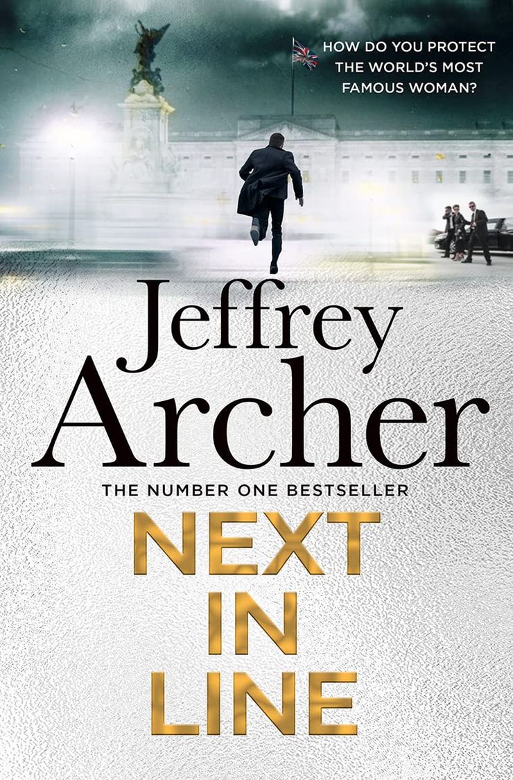
Next In Line
by Jeffrey Archer
Set in London in 1988 as Royal fever sweeps the nation, New Scotland Yard are on high alert to protect the most famous family on earth. With such responsibility, comes great pressure and so Detective Chief Inspector William Warwick and his Scotland Yard squad are sent to investigate the team. But soon they realise the problems in Royalty Protection are just the beginning as a renegade organisation has the security of the country – and the Crown – in its sights . . .
Traitors Gate
by Jeffrey Archer
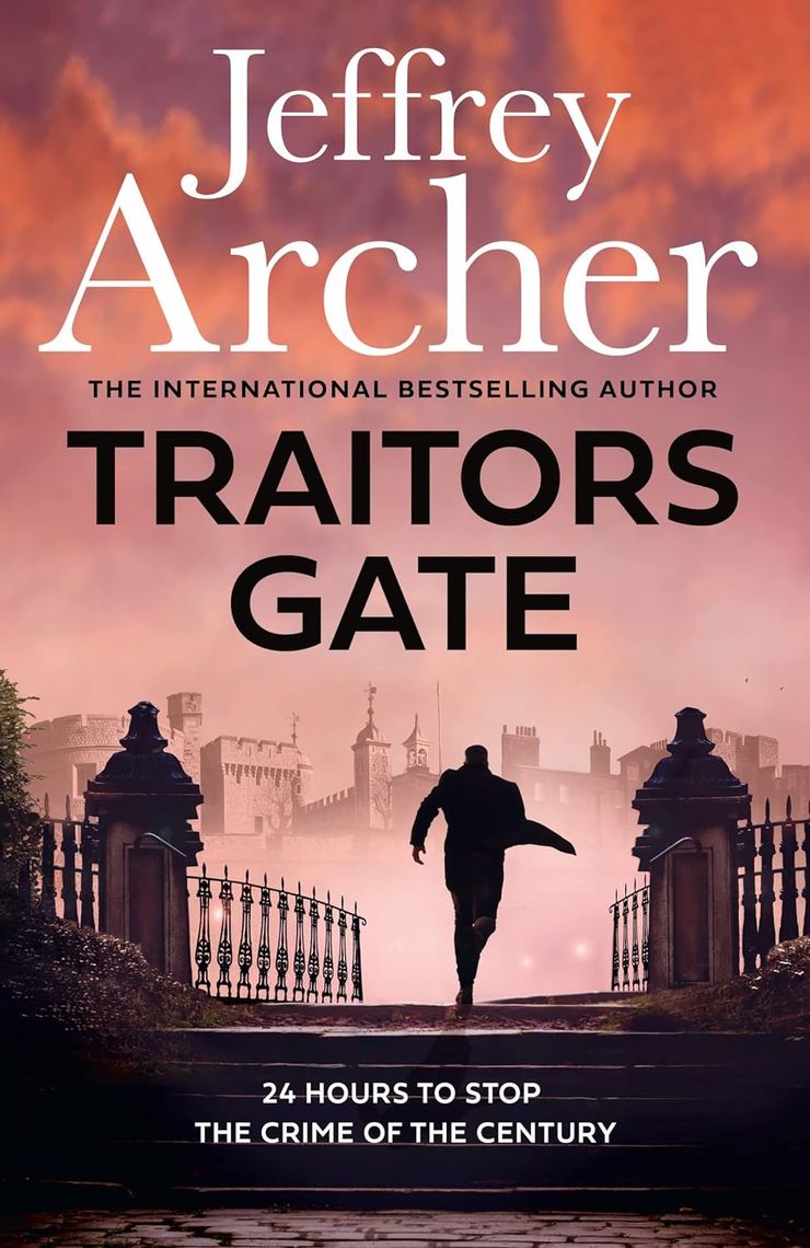
Chief Superintendent William Warwick and his trusty comrade Inspector Ross Hogan, seasoned pros in guiding prized Crown Jewels through the labyrinth of London, face a conundrum. Their hitherto smooth operations have hit a snag — Miles Faulkner, a wily criminal mastermind, has charted an audacious theft that could upend history itself. With an insider feeding Faulkner's plans, Warwick and Hogan's duty transcends routine — they're on a mission to prevent the crime of the century. Dive into this thrilling journey, where every tick of the clock matters!
You might also love these books by Jeffrey Archer:
Kane and Abel
by Jeffrey Archer
Published in 1979, Kane and Abel is one of renowned storyteller Jeffrey Archer’s best selling novels. William Lowell Kane and Abel Rosnovski were born on the same day, on opposite sides of the world. William was born into a rich Boston family, while Abel was the son of a penniless Polish immigrant. Despite their different lives, fate is destined to bring them together as they both embark on a ruthless struggle to build a fortune. Spanning sixty years, this is the captivating story of two powerful men who will either save or destroy each other.
The Prodigal Daughter
by Jeffrey Archer
In Jeffrey Archer's The Prodigal Daughter, the titanic battle between two men obsessed with destroying each other follows on to the next generation. Florentyna Rosnovski, Abel's daughter, inherits all of her father's drive, but none of his wealth. Gifted with beauty and spirit, but above all with indomitable will, she sets out in pursuit of an ambition that dwarfs both Kane and Abel, as she battles for the highest office of all . . .
The Short, The Long and The Tall
by Jeffrey Archer
In The Short, The Long and The Tall the master storyteller joins forces with renowned illustrator Paul Cox, to re-imagine twenty of Jeffrey Archer's most popular and feted short stories alongside beautifully rendered watercolour illustrations.


