You're gonna need a bigger boat: a Pan history of Jaws
We took a trip into the Pan paperback archive to take a look at the different covers for the classic thriller.

1974: The year of the Watergate scandal, the invention of the Rubix cube, and the publication of Jaws. Peter Benchley's 1974 story of a town terrorised by a deep-sea monster went on to inspire one of the most terrifying films of all time, and an iconic cover image to match.
To mark the 70th anniversary of the publication of the first Pan paperback we took a look back into the Pan archive to get the story behind the original cover design for this classic thriller novel.
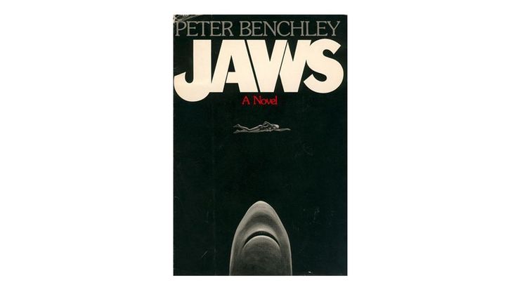
The original cover (1974)

No-one knew in 1974 that Benchley's thriller would be adapted into one of the most watched, and feared, films of the decade. Before deciding on a concept for the book's first publication the Pan design team cycled through a number of different images and titles, including The Stillness in the Water and The Leviathan. They settled on this a black and white design which depicts the iconic first scene of the book.
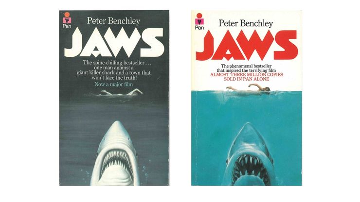
The paperback and film tie-in (1975)

In the summer of 1975, an entire generation of swimmers became a lot less likely to take a dip in the ocean, thanks to the release of Steven Spielberg's terrifying big screen adaptation of Jaws. Using the Great White Shark Exhibit at the American Museum of Natural History and a model who he paid $35 to perch across two stools as inspiration, poster artist Roger Kastel painted the original artwork for the paperback cover which was then adapted and used on the film poster the following year. Despite its value as a piece of film memorabilia, the original painting has since been lost.
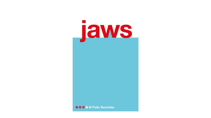
The 70th anniversary re-design (2017)

When planning the new covers for the 70th Anniversary collection the Pan design department considered a number of different approaches. Ideas for the design refresh for Jaws ranged from using a photographic design, to a typography-led approach to the idea of maintaining the iconic rising shark head, but with a retro twist.
The final re-design of Jaws, one of the designs in the Pan 70th anniversary collection, recalls the famous original image from the 1975 cover, with its bright blue sea and blood red title. By replacing the famous teeth with a simple shark fin, designer Justine Anweiler, has brought a fresh and minimalist new twist to the iconic image of the world's most feared sea creature.


